# Dark-Mode Support with Chakra-UI and Next.js
This article is the third article, in a series where we take a look at [Building modern web apps with Chakra-UI and Next.js](https://gsdev.hashnode.dev/series/chakra-ui).
## Prerequisites
- General Understanding of CSS principles
- Familiarity with React and Next.js
- Must have [Node.js](https://nodejs.org/en/) v12.22.0 or later installed.
In this article, we'll take a look at implementing dark-mode for our Chakra/Next sandbox. Dark-mode support has become a lot easier to implement and manage due to the recent implementation of the [prefers-color-scheme](https://developer.mozilla.org/en-US/docs/Web/CSS/@media/prefers-color-scheme) media query which already has pretty solid browser support today.
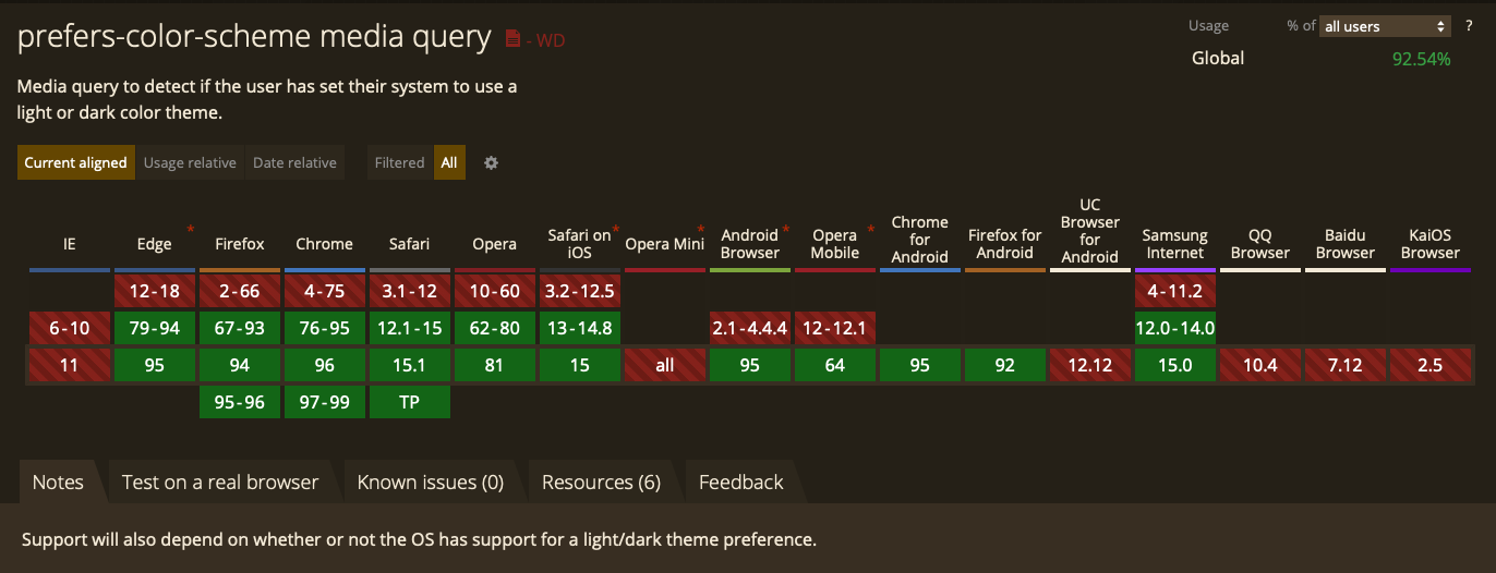
> Browser adoption stats from [caniuse.com](https://caniuse.com/?search=prefers-color-scheme)
This gives us some great support for respecting the end user's the preferred color scheme defined in their browser settings.
## Installation
If you're just starting this series with this article, you can follow along by using the [02.persistent-layout](https://github.com/gaurangrshah/chakra-next-sandbox/tree/02.persistent-layout) branch of our sandbox repo as your starting point or you can fork this [codesandbox](https://codesandbox.io/s/02-chakra-persistent-layout-z10eg).
```shell
git clone --branch 02.persistent-layout git@github.com:gaurangrshah/chakra-next-sandbox.git sandbox
```
Next, let's make sure our dependencies are up to date.
```shell
cd sandbox && yarn
```
And then let's go ahead and make sure our project works as expected.
```shell
yarn dev
```
If all goes well you should see something like the screenshot below:
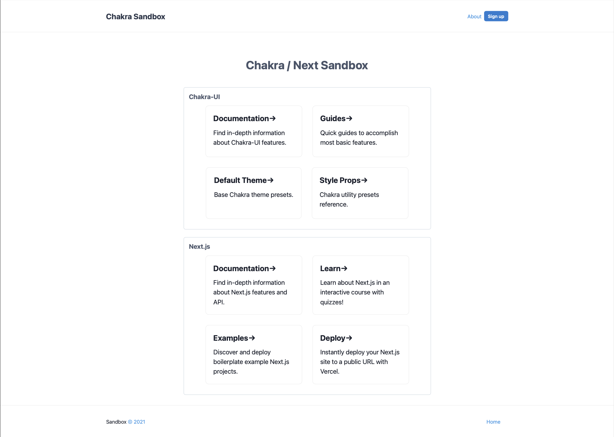
Now that your project is running locally, let's take a quick moment to discuss how dark-mode works in Chakra-UI.
Chakra ships with `dark-mode` support built-in, even though we haven't taken a single step towards it, your boilerplate sandbox already has support for dark mode built-in.
So before we begin we'll take a look at how it works out of the box. If you have [react-dev-tools](https://chrome.google.com/webstore/detail/react-developer-tools/fmkadmapgofadopljbjfkapdkoienihi) installed you can follow along in your dev tools `component` panel as shown below.
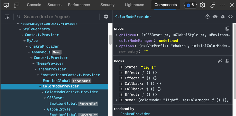
> Select the `ColorModeProvider` from the component tree, and you should see something similar to the props and hooks panels on the right.
Next, let's manually change the state shown in the panel from" `light`" to " `dark`":
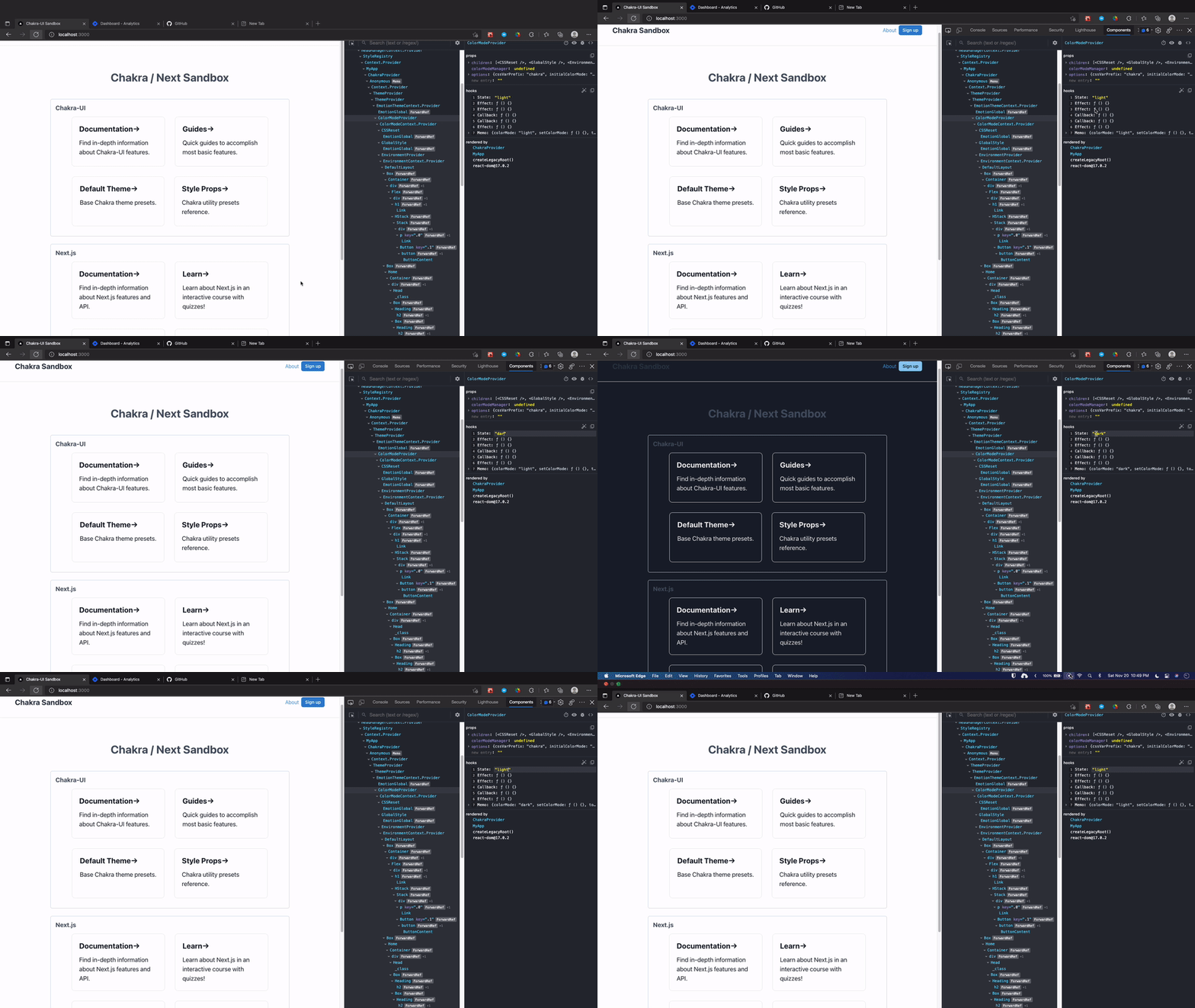
As you can see, we didn't have to do anything at all, and that's because Chakra-UI ships with the support out of the box. This is also because we haven't defined any background colors, if we had, we'd be taking the responsibility into our own hands. And that's when the honus falls onto us, we'd then be responsible for defining custom colors for each `color-mode`. And that's what we'll spend the rest of this article talking about.
## Configuration
Let's start by updating our global styles to add `color-mode` support.
If you look at the `global.js` file, you'll notice that our `global()` method has access to the props object.
```js
// chakra/global.js
export const styles = {
global: (props) => ({
/* ...global styles */
});
}
```
We'll use these props to destructure the available `color mode` variable from the props object:
```js
export const styles = {
global: ({ colorMode }) => ({
/* ...global styles */
});
}
```
We can make this a bit easier to implement by being more explicit with our function syntax:
```js
export const styles = {
global: ({ colorMode }) => {
const isDarkMode = !!(colorMode === 'dark');
return {
/* ...global styles */
};
}
}
```
Now that we have access to the `isDarkMode` variable we can use it to define or `color-mode` specific styles. Let's start by tackling the low-hanging fruit and quickly add `color-mode` support to our `.page-wrap` element.
```js
// chakra/global.js
export const styles = {
global: ({ colorMode }) => {
const isDarkMode = !!(colorMode === 'dark');
return {
/* ...global styles */
".page-wrap": {
backgroundColor: isDarkMode ? 'var(--chakra-colors-brand-900)' : 'var(--chakra-colors-brand-100)',
/*...*/
},
};
}
}
```
> **☝️NOTE: ** You could've also applied the background color directly to the `HTML` or `body` elements, we've simply used the `.page-wrap` element for our example because this is the purpose we defined it for.
>
> **☝️RECALL:** In the [last article](https://gsdev.hashnode.dev/persistent-layout-with-chakra-ui-and-nextjs) we briefly touch on using CSS variables (a.k.a. [custom-properties](https://developer.mozilla.org/en-US/docs/Web/CSS/Using_CSS_custom_properties)) to style parts of our application.
>
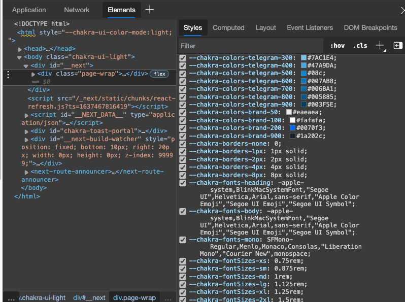
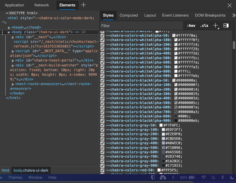
> Chakra-UI automatically exposes a bunch of its preset variables for things like colors and spacing as CSS variables. This also applies to any custom theme variables that you've applied yourself. You can view all of the exposed variables via your browser's dev tools elements panel.
>
> 
You can now test your color-mode transitions by once again using the react-dev-tools extension just as we did together earlier.
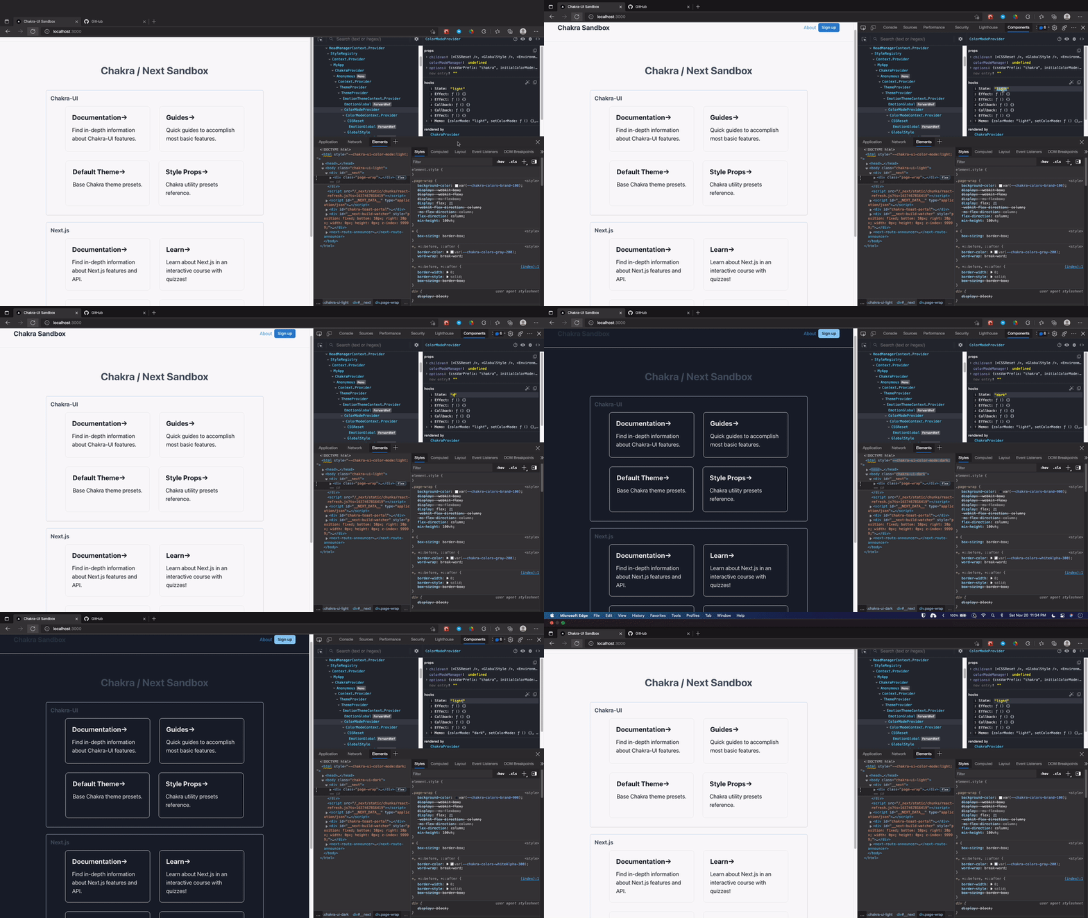
As you may notice at a glance, our custom background colors have now been applied.
Next, let's talk about how we can introduce a control element to help toggle our color modes. You may be familiar with the trend of using the switch element for this purpose, but we'll be doing something a bit more compact. Hopefully slightly more intuitive, as well, but still just as useful.
Let's start by creating a new directory within your `/charkra` directory called `/components`
```shell
mkdir chakra/components && touch chakra/components/mode-toggle.js
```
We'll also need some icons and chakra provides a seprate package with some simple and clean svg icons, let's go ahead and install the package shown below:
**☝️NOTE:** You can use any icon library you prefer with this technique so feel free!
```shell
yarn add @chakra-ui/icons
```
```jsx
// chakra/components/mode-toggle.js
import { IconButton, useColorMode } from "@chakra-ui/react";
import { MoonIcon, SunIcon } from "@chakra-ui/icons";
export const ModeToggle = () => {
const { colorMode, toggleColorMode } = useColorMode();
return (
: }
zIndex='sticky'
/>
);
};
```
> **☝️ NOTE:** Chakra exposes the useful [useColorMode](https://chakra-ui.com/docs/features/color-mode#usecolormode) hook that we can use to gain access to the current color mode in our functional components.
Now that we have the component we'll use it to toggle our `color-modes` let's go ahead and render it within our `DefaultLayout` component.
```jsx
// chakra/Layouts/default.js
import Link from 'next/link'
import { Box, Button, chakra, Container, Flex, HStack } from '@chakra-ui/react'
import { ModeToggle } from '../components/mode-toggle';
export const DefaultLayout = (props) => {
const { children } = props;
return (
{ /* ... */ }
);
}
```
With this in place, we now have a toggle button rendered on the lower-right hand side of the browser window. We can use this button to toggle between our `color-modes`. Go ahead and give it a try.
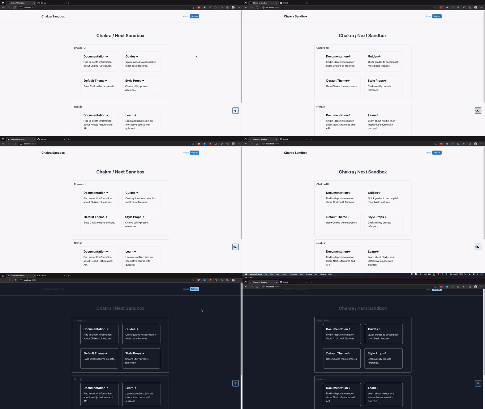
There are a few other things to make note of here. Notice that many of the default chakra elements such as the `signup` button also changes its shade along with all of the text and even our newly implemeted `ModeToggle` button.
Default chakra components are "theme-aware" which is to say they'll respond to thematic changes. In my experience with chakra I have found the thoughtfulness of these types of utilities is what really gives Chakra-UI it's incredible DX.
You can always override chakra presets either explicitly within each component or globally by either creating new variants or overwriting the originals. You have a lot of options to complete the task, so I suggest choosing the implementation that best fits your project's needs.
## Defining Color Scheme
Now let's look at how to better manage your color-mode-related style options. If you dig around through the Chakra-UI default theme, you'll notice that there's a naming convention where the properties of the colors object are objects themselves. This allows us to reference colors from our theme using the dot notation.
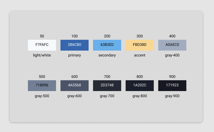
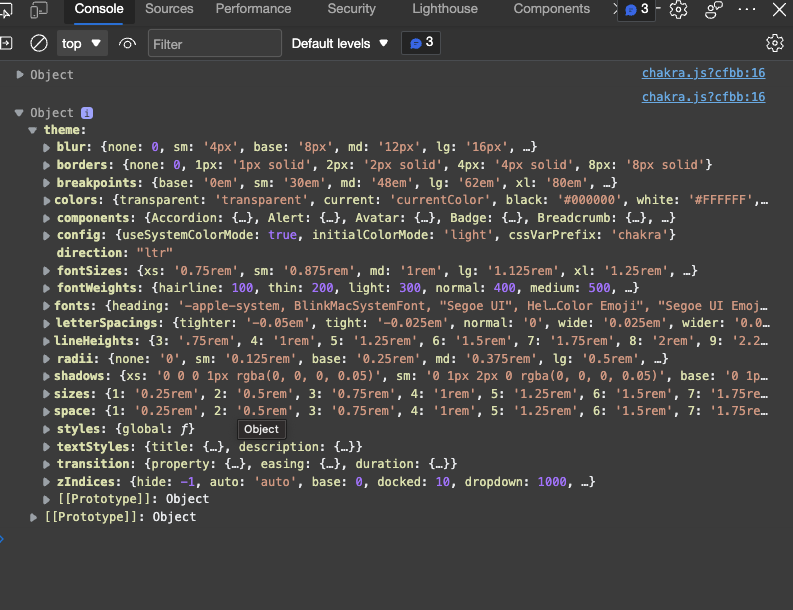
For example, some of the colors above are taken directly from the default theme object and is a preset provided by chakra. You can always check what CSS variables are exposed by chakra in your browser dev tools:
Or you can also log the current theme object out to the console:
```js
// chakra/index.js
export const theme = {
/* ... */
colors: {
brand: {
50: "#F7FAFC",
100: "#EDF2F7",
200: "#E2E8F0",
300: "#CBD5E0",
400: "#A0AEC0",
500: "#718096",
600: "#4A5568",
700: "#2D3748",
800: "#1A202C",
900: "#F7FAFC",
}
}
}
```
You can even use this [Ramp Generator](https://rampgenerator.com/?unique_colors=2&steps=10&min_color=%23F7FAFC&max_color=%23171923&min_value=0&max_value=100&decimals=2&opacity=1&col=COLUMN_NAME&units=&default_tab=TABLE&updated=1) tool to generate your own color scales by providing a starting and ending color.
## Additional Configuration
The following configuration settings will help with things like avoiding unstyled flashes from hydration and supporting the user's preferred color scheme.
Let's start by implementing support for the user's preferred color-scheme, by adding a `config` object onto our theme object.
```js
// chakra/index.js
import { extendTheme } from "@chakra-ui/react"
import { styles } from './global';
import { textStyles } from './text-styles';
const config = {
// color mode user-preference configuration
initialColorMode: 'light',
useSystemColorMode: true,
}
export const theme = extendTheme({
config,
textStyles,
styles,
colors: {
brand: {
50: "#eaeaea",
100: "#fafafa",
200: "#0070f3",
900: "#1a202c",
},
},
});
```
With this in place, we can now detect the user's preferred color scheme in the browser.
### Next.js SSR support.
Server-side rendered pages might actually still have an issue where it may take some time for it to recognize the user's selected preference, and this can lead to a flash of unstyled content that then gets redrawn when the `color-mode` script becomes available. To avoid this we can take some steps to ensure we can determine the color preference before rendering the page.
To do this we'll start by creating a `Chakra` utility component that we can use to wrap our `ChakraProvider` with to ensure we're can encapsulate our color-mode support logic.
```shell
mkdir chakra/utils && touch chakra/utils/chakra.js
```
```jsx
// chakra/utils/chakra.js
import {
ChakraProvider,
// chakra provided storage managers:
cookieStorageManager,
localStorageManager,
} from "@chakra-ui/react"
import { theme } from "../index"
export function Chakra({ cookies, children }) {
// b) Pass `colorModeManager` prop
const colorModeManager =
typeof cookies === "string"
? cookieStorageManager(cookies)
: localStorageManager;
console.log({ theme });
return (
{children}
)
}
// also export a reusable function getServerSideProps
export function getServerSideProps({ req }) {
return {
props: {
// first time users will not have any cookies and you may not return
// undefined here, hence ?? is necessary
cookies: req.headers.cookie ?? "",
},
}
}
```
> **☝️ NOTE: ** As we explored earlier chakra uses local storage and/or cookie storage to store the current color mode or set its value directly from the user's browser preferences.
>
> This configuration is only required for `SSR` pages in `next.js`, which will prioritize the use of cookies over local-storage, which will allow the server-rendered pages to have access to our color-mode during their rendering cycle.
>
> If you're not relying on `SSR` at all in your application, then you can simply ignore this and continue using the default `local-storage` support.
Now in our `/page/_app.js` file, we can use the `Chakra` utility component we just created and replace the `ChakraProvider` that is currently rendered.
```jsx
// pages/_app.js
import { DefaultLayout } from '../chakra/Layouts/default'
import { Chakra } from "../chakra/utils/chakra";
function MyApp({ Component, pageProps }) {
return (
)
}
export default MyApp
export { getServerSideProps } from '../chakra/utils/chakra';
```
### Known Issues
There still are a few scenarios where you may still see a flash of `color-modes` between page loads, you can find out a bit more [here in the chakra docs](https://chakra-ui.com/docs/features/color-mode#color-mode-flash-issue).
That's going to do it for implementing dark-mode with Chakra-UI.
Thanks for sticking around and reading through the article. I hope you found this walkthrough useful, please feel free to reach out if you have any questions.
If you're a Chakra-UI user, I'd love to hear about the different patterns you use to solve some of the more common problems.
I'll be back soon with the next installment of the series. Please feel free to follow me here and on [twitter](https://twitter.com/Soham_Asmi).