# Persistent Layout with Chakra-UI and Next.js
This post is the second installment of the Getting Started with Chakra-UI series. We'll be using the finished project from the original article as our starting point for this article. You can find the starter on [CodeSandbox](https://codesandbox.io/s/01-chakra-getting-started-5plv9?from-embed) or [clone the repo](https://github.com/gaurangrshah/chakra-next-sandbox.git).
## Setup
Simply clone the repo and remember to run `yarn` or `npm install` to install the required dependencies.
```shell
git clone https://github.com/gaurangrshah/chakra-next-sandbox.git sandbox
```
```shell
cd sandbox && yarn
```
## Why Persistent Layouts?
Persistent layouts allow us to optimize single-page applications (SPAs) by limiting component re-renders we can create a better user experience for the end-user. This is done by creating a `Layout` component and rendering it as far up in the DOM tree as possible. This means that any transitions between pages that share the same Layout will not re-render any static `Layout` elements that don't update during page transitions. The impact of this on the end-user is a seemingly faster and more consistent browsing experience.
A `Layout` component is generally responsible for rendering the scaffolding of your application, this may include certain common elements like the Header, Footer, and Main sections. Since we expect these elements to remain consistent from page to page we can take advantage of these static elements on our page and optimize their re-renders.
## Implementing Layout
Let's start by updating the global styles for our project which you will find defined in `chakra/global.js`, you can update the same file in your starter sandbox project to match the styles shown below:
```js
// chakra/global.js
export const styles = {
global: (props) => ({
'html, body': {
padding: 0,
margin: 0,
height: '100%',
fontFamily: `-apple-system, BlinkMacSystemFont, Segoe UI, Roboto, Oxygen,
Ubuntu, Cantarell, Fira Sans, Droid Sans, Helvetica Neue, sans-serif`,
fontSize: '16px',
},
".page-wrap": {
display: 'flex',
flexDirection: 'column',
minHeight: '100vh',
},
a: {
color: 'inherit',
textDecoration: 'none'
},
'*': {
boxSizing: 'border-box'
},
header: {
padding: '2rem 2rem',
height: '100px',
borderBottom: '1px solid #eaeaea',
},
main: {
flex: 1,
display: 'flex',
flexDirection: 'column',
justifyContent: 'center',
alignItems: 'center',
margin: '2rem 0',
},
footer: {
height: '100px',
padding: '1rem 0',
borderTop: '1px solid #eaeaea',
a: {
display: 'flex',
justifyContent: 'center',
alignItems: 'center',
flexGrow: 1,
}
},
code: {
background: '#fafafa',
borderRadius: '5px',
padding: '0.75rem',
fontSize: '1.1rem',
fontFamily: `Menlo, Monaco, Lucida Console, Liberation Mono, DejaVu Sans Mono,
Bitstream Vera Sans Mono, Courier New, monospace`
}
})
}
```
You may notice we've added some base styles for our page-wrap and header elements. We've also implemented some style updates for the main and footer elements as well. One thing to note is that when defining styles for HTML elements like shown above, we can simply render the native element and the styles will be automatically applied just as you would expect with a normal CSS stylesheet. Let's take a look at how we can integrate these styles with a new Layout component:
> **NOTE:**
> We can also use CSS variables (a.k.a. [Custom Properties](https://developer.mozilla.org/en-US/docs/Web/CSS/Using_CSS_custom_properties) ) for our colors, since Chakra-UI defines a variable for each of the colors in our theme. Your color name will be prefixed with `--chakra`. The same applies for other variables as well, including shadows, borders, etc. Take a look in your browser's dev tools and you'll notice all of the variables defined by chakra on the root element.
Next up, let's create our `Layout` scaffold, we'll start by creating a new file `chakra/Layouts/default.js` and introducing an element with the className: `.page-wrap`.
```jsx
// chakra/Layouts/default.js
import Link from 'next/link'
import { Box } from '@chakra-ui/react'
export const DefaultLayout = (props) => {
return (
Wrapper
);
}
```
With this in place, we have the skeleton of our default `Layout`, let's proceed by adding the core components that will make up the bulk of our `Layout` component starting with the header:
```jsx
import Link from 'next/link'
import { Box, Button, chakra, Container, Flex, HStack } from '@chakra-ui/react'
export const DefaultLayout = (props) => {
const { children } = props;
return (
Chakra Sandbox
About
);
}
```
Here, we've rendered a simple header element, and you may have noticed that we didn't need to define styles for this element either because it is also automatically inheriting the styles we defined in `global.js`. We've also added a container component inside the header which is simply used to limit the `max-width` of our header content. Next, we've wrapped our `Next.js` `Link` component with an `h1` element which allows us to style the link text accordingly.
> **NOTE:** the text elements here have been prefixed with the `chakra` factory function. This function can be used to allow native HTML elements to inherit the Chakra-UI style api, and we can pretty much use the element as is without having to additionally import a `Heading` or `Text` component from the Chakra-UI library.
The `HStack` component is rendered as a `nav` element, but allows us to horizontally stack elements inside of it, similar to a `flex` element where the `flex-direction` is equal to "row". Inside the `HStack` we've rendered a single nav-link for the about page (which we will create in just a moment), but allows for including additional links if and when needed. Lastly, we have a simple signup button that currently just prompts the user with an `alert` message when clicked.
Next up, we have two final components of the default `Layout`: the `main` and `footer` elements. These are both simple presentational components so there's really not much to them:
```jsx
import Link from 'next/link'
import { Box, chakra, Container, Flex } from '@chakra-ui/react'
export const DefaultLayout = (props) => {
const { children } = props;
return (
);
}
```
Both the `main` and `footer` elements once again inherit their styles directly from the styles we defined for them in `global.js`. The `main` element is responsible for rendering the rest of our application via the `children` prop whereas the `footer` element simply renders our copyright notice and a link back to our homepage. You'll also notice we're using a `Container` component to once again limit the max-width of the `footer` element's content.
That's it for the `Layout` component now we can get this rendered by wrapping it around our entire application. Since this is the only layout for our current application we don't need to do any kind of reconciliation just yet. All we need to do is simply render the `Layout` component as high up in the DOM tree as possible which in a `Next.js` application is exposed to us via `pages/_app.js`:
```jsx
// pages/_app.js
import { ChakraProvider } from "@chakra-ui/react"
import { theme } from "../chakra"
import { DefaultLayout } from '../chakra/Layouts/default';
function MyApp({ Component, pageProps }) {
return (
)
}
export default MyApp
```
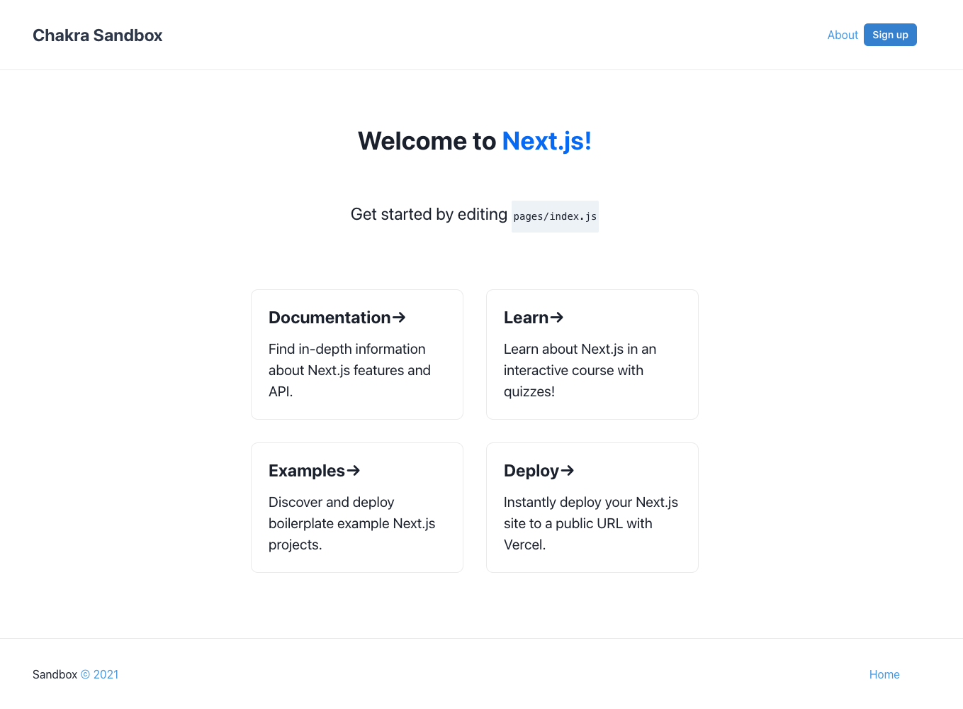
Next, we'll need to make a simple change to our `pages/index.js` file and remove the vertical padding we had originally applied to the root `Container` component as well as the Vercel branded `footer` in favor of our custom `footer` that we've just created for the `Layout` component.
```jsx
// pages/index.js
import Head from "next/head";
import { Container } from "@chakra-ui/react";
const cardStyles = {
margin: 4, // preset for '1rem'
padding: 6, // preset for '1.5rem'
textAlign: "left",
color: "inherit",
textDecoration: "none",
border: "1px solid",
borderColor: "brand.50",
borderRadius: "10px",
transition: "color 0.15s ease, border-color 0.15s ease",
maxWidth: "300px",
_hover: {
color: "brand.200",
borderColor: "brand.200"
},
_focus: {
color: "brand.200",
borderColor: "brand.200"
},
_active: {
color: "brand.200",
borderColor: "brand.200"
},
h2: {
marginBottom: 4, // preset for '1rem'
fontSize: "2xl" // preset for '1.5rem'
},
p: {
m: 0,
fontSize: "xl",
lineHeight: "base"
}
};
export default function Home() {
return (
Create Next App{/*....*/}
{ /*
-- REMOVE BOILERPLATE FOOTER BOILERPLATE ELEMENT --
*/ }
);
}
```
Now if you were to run your project and view it in the browser at `http://localhost:3000` you'll notice that your application now has the `Layout` implemented.
Next up let's create a simple `AboutPage` component that we can use to render the content of our About page, this will help us demonstrate the power of persisting our `Layout` when transitioning between pages.
Let's start by creating a new file `pages/about.js` :
```jsx
// pages/about.js
import { Container } from '@chakra-ui/react'
export default function AboutPage() {
return (
About
Lorem ipsum dolor sit amet, consectetur adipisci elit, sed eiusmod tempor incidunt ut labore et dolore magna aliqua. Ut enim ad minim veniam, quis nostrum exercitationem ullam corporis suscipit laboriosam, nisi ut aliquid ex ea commodi consequatur. Quis aute iure reprehenderit in voluptate velit esse cillum dolore eu fugiat nulla pariatur. Excepteur sint obcaecat cupiditat non proident, sunt in culpa qui officia deserunt mollit anim id est laborum.
)
}
```
There isn't a lot going on here, but we now have a placeholder for some content that we can update later and still use it to demonstrate page transitions in the meantime.
As you can see from the gif above the header and footer seemingly do not re-render. I use the term "seemingly" because there are several reasons why `React` components actually re-render and there can be many reasons why components like `header` may be forced to re-render including several minor things. For example, styles being applied to indicate the active nav-link. For our purposes, this is really all you need in order to implement a single persistent layout with `Chakra-UI` in a `Next.js` application.
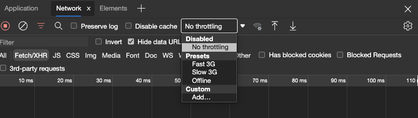
> **NOTE:** `Next.js` is partly responsible for the speed of the loading between our pages in the example, this is to say that although we've persisted our layout our crude example loads quite fast so you may not even notice the difference. If you really want to test it, hop into your developer tools and simulate your connection for a slower device.
We'll discuss some of these other optimizations and use-cases in future articles when this becomes more of a factor.
For now, I'd like to take a quick sidebar to add just a few more links to the card layout on the homepage. To be clear this portion of our topic is entirely unrelated to the persistent layout goal but will help set up our sandbox for future articles, and allow us to keep some quick links close by for when we need to do some digging through the docs.
Currently, we're individually rendering each link, and since we'd like to expand upon this, I'd like to take a different approach so we can easily add links to our UI in the future.
```jsx
// pages.index.js
const cards = {
nextLinks: [
{
title: 'Documentation',
href: 'https://nextjs.org/docs',
description: 'Find in-depth information about Next.js features and API.'
},
{
title: 'Learn',
href: 'https://nextjs.org/learn',
description: 'Learn about Next.js in an interactive course with quizzes!'
},
{
title: 'Examples',
href: 'https://github.com/vercel/next.js/tree/master/examples',
description: 'Discover and deploy boilerplate example Next.js projects.'
},
{
title: 'Deploy',
href: 'https://vercel.com/new?utm_source=create-next-app&utm_medium=default-template&utm_campaign=create-next-app',
description: 'Instantly deploy your Next.js site to a public URL with Vercel.'
},
]
}
```
Here we've simply created an array of our `Next.js` links that we can use to iteratively render the link cards in our UI.
```jsx
// pages/index.js
import { Box, Container, Flex, Heading, Link, Text } from "@chakra-ui/react"
/*.. */
export default function Home() {
const { nextLinks } = cards;
return (
Chakra-UI Sandbox
Welcome to{" "}
Next.js!
Get started by editing pages/index.js
{nextLinks.map((link) => (
{link.title}→{link.description}
))}
)
}
```

With this in place, we've updated the layout to render dynamically, now we can easily add new links as we need, but before we do let's remove the default `Next.js` heading and text from the boilerplate.
```jsx
import { Box, Container, Flex, Heading, Link, Text } from "@chakra-ui/react"
/*.. */
export default function Home() {
const { nextLinks } = cards;
return (
Chakra-UI Sandbox
Chakra / Next Sandbox
{nextLinks.map((link) => (
{link.title}→{link.description}
))}
)
}
```
And now we can add more links, this time we'll add some links that we can use as a reference, from the chakra docs:
```js
// pages/index.js
const cards = {
chakraLinks: [
{
title: 'Documentation',
href: 'https://chakra-ui.com/docs/getting-started',
description: 'Find in-depth information about Chakra-UI features.'
},
{
title: 'Guides',
href: 'https://chakra-ui.com/guides/integrations/with-cra',
description: 'Quick guides to accomplish most basic features.'
},
{
title: 'Default Theme',
href: 'https://chakra-ui.com/docs/theming/theme',
description: 'Base Chakra theme presets.'
},
{
title: 'Style Props',
href: 'https://chakra-ui.com/docs/features/style-props',
description: 'Chakra utility presets reference.'
}
],
nextLinks: [/* ...*/ ]
}
```
Now that we've added our `chakraLinks` we can render them the same way we did with the `nextLinks`:
```jsx
import Head from 'next/head'
import { Box, Container, Flex, Heading, Link, Text } from "@chakra-ui/react"
const cardStyles = {
margin: 4, // preset for '1rem'
padding: 6, // preset for '1.5rem'
textAlign: 'left',
color: 'inherit',
textDecoration: 'none',
border: '1px solid',
borderColor: 'brand.50',
borderRadius: '10px',
transition: 'color 0.15s ease, border-color 0.15s ease',
maxWidth: '300px',
minH: '10rem',
'_hover': {
color: 'brand.200',
borderColor: 'brand.200'
},
'_focus': {
color: 'brand.200',
borderColor: 'brand.200'
},
'_active': {
color: 'brand.200',
borderColor: 'brand.200'
},
h2: {
marginBottom: 4, // preset for '1rem'
fontSize: '2xl' // preset for '1.5rem'
},
p: {
m: 0,
fontSize: 'xl',
lineHeight: 'base',
}
}
const cards = {
chakraLinks: [
{
title: 'Documentation',
href: 'https://chakra-ui.com/docs/getting-started',
description: 'Find in-depth information about Chakra-UI features.'
},
{
title: 'Guides',
href: 'https://chakra-ui.com/guides/integrations/with-cra',
description: 'Quick guides to accomplish most basic features.'
},
{
title: 'Default Theme',
href: 'https://chakra-ui.com/docs/theming/theme',
description: 'Base Chakra theme presets.'
},
{
title: 'Style Props',
href: 'https://chakra-ui.com/docs/features/style-props',
description: 'Chakra utility presets reference.'
}
],
nextLinks: [
{
title: 'Documentation',
href: 'https://nextjs.org/docs',
description: 'Find in-depth information about Next.js features and API.'
},
{
title: 'Learn',
href: 'https://nextjs.org/learn',
description: 'Learn about Next.js in an interactive course with quizzes!'
},
{
title: 'Examples',
href: 'https://github.com/vercel/next.js/tree/master/examples',
description: 'Discover and deploy boilerplate example Next.js projects.'
},
{
title: 'Deploy',
href: 'https://vercel.com/new?utm_source=create-next-app&utm_medium=default-template&utm_campaign=create-next-app',
description: 'Instantly deploy your Next.js site to a public URL with Vercel.'
},
]
}
export default function Home() {
const { chakraLinks, nextLinks } = cards;
return (
Chakra-UI Sandbox
Chakra / Next Sandbox
Chakra-UI
{chakraLinks.map((link) => (
{link.title}→{link.description}
))}
Next.js
{nextLinks.map((link) => (
{link.title}→{link.description}
))}
)
}
```
And that's it we've added some additional styling to help group our two different sets of links accordingly and made it easy enough to add links in the future.
Hey, thanks for sticking around and reading. I hope you found this walkthrough useful, please feel free to reach out if you have any questions.
If you're a Chakra-UI user, I'd love to hear about the different patterns you use to solve some of the more common problems.
I'll be back soon with the next installment of the series. Please feel free to follow me here and on [twitter](https://twitter.com/Soham_Asmi).