
Getting Started with Next.js and Chakra-UI

This article is the start of a series, where I attempt to document some of my learnings, tips, tricks, ... etc. of using Chakra-UI to create fully accessible modern web applications. Over the past few years, I've thoroughly enjoyed using Chakra-UI in various projects large and small. It affords me an ease of use and versatility that I've never really experienced with front-end tooling. In short, working with Chakra-UI is pure joy, and... that kind of joy should be shared.
To be clear there are tons of great options when it comes to UI libraries and frameworks. I'm personally a big advocate for trying things and seeing what feels right. And that's exactly how I happened to stumble upon Chakra-UI.
In my experience front-end styling has always been a bit of a 💚 / 💔 relationship. From the early days of B.E.M. Architecture to compilers like Sass and Less and now the plethora of options including utility first frameworks,CSS-in-JS` libraries, and with conventional options still deemed viable --- these are wild times in the front-end world.
Why Chakra-UI?
It may be of no surprise that choosing the right option for each project becomes of the utmost importance. Depending on the project this single decision could impact everything from build times to development costs - everything is fair game including bundle size, project delivery, developer satisfaction, development costs, and I'd argue most importantly... end-user experience.
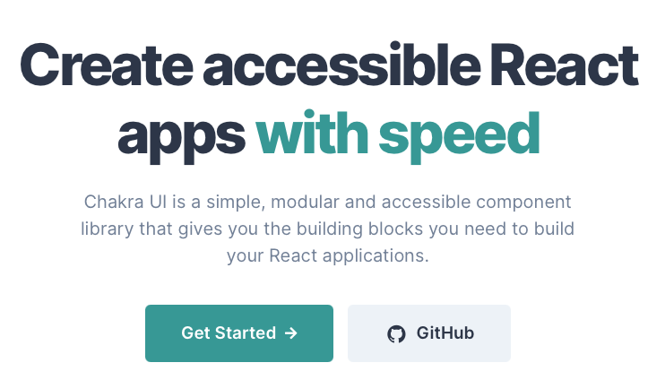
Because of its focus on accessibility Chakra-UI really shines in the browser context. Honestly, you'd have to work really hard to sell me on why any other option is a better choice for the web. Thanks to the Chakra team who delivers on their promise by providing the essential building blocks we need to build fully accessible modern web applications with a nice selection of modular components.
In my experience, Chakra's API design has been nothing short of brilliant! It's clean, thoughtful, and highly extensible. Not to mention the fact that Chakra-UI is incredibly intuitive to pick up for anyone coming to Chakra-UI from any CSS-in-JS library or Utility-First framework. So let's dive in, shall we?
Overview
Prerequisites:
- General Understanding of CSS principles
- Familiarity with React and Next.js
- Must have Node.js v12.22.0 or later installed.
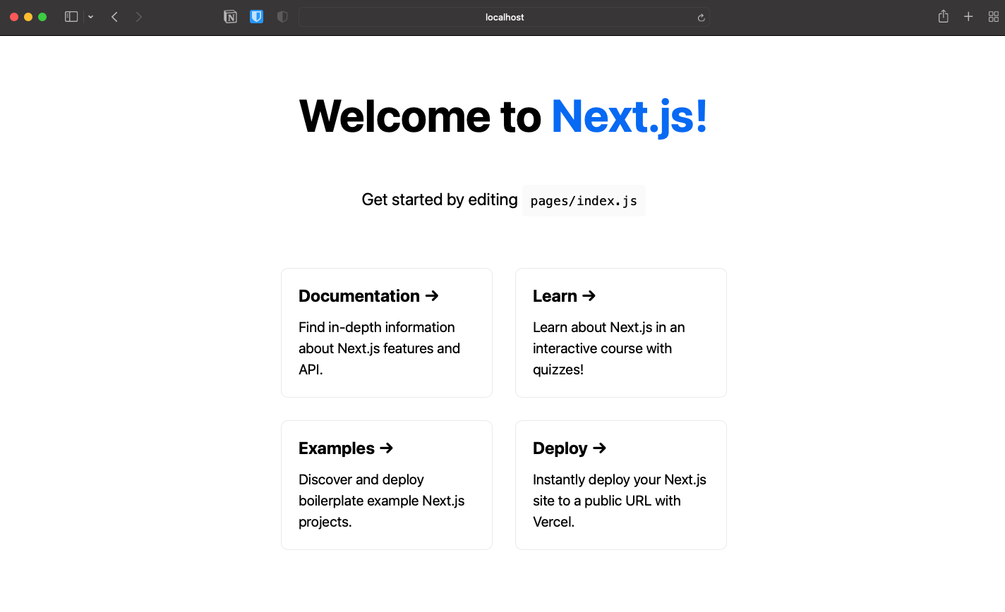
The goal of this article is to introduce you to the Chakra-UI library by setting up a quick sandbox project. This sandbox will be the starting point of all of the articles that follow in this series. We'll start by cloning the default landing page that ships with create-next-app. (See the codesandbox link below for a demo of what we'll be building).
So without further adieu, let's get started...
Getting Started
Chakra-UI's documentation has always been great for getting started, but in recent versions, it has improved dramatically. So if you have any issues with the setup, you can always refer back to the documentation.
For posterity:
As of today, the current version:
- of Chakra-UI is
v1.6.10- of Next.js is:
v12.0.1-- documentation.If you find this article to be outdated at some point in the future, please:
- Send me a quick message and let me know.
- Refer to Chakra-UI's Getting Started Guide - it's pretty awesome.
Also note: You can follow along with the completed version on codesandbox

Installation
First, we'll start by creating a default Next.js application called 'sandbox'
npx create-next-app@latest sandbox
Let's make sure everything is wired up properly..
cd sandbox && yarn
yarn dev
Before we go any further let's talk a bit about styling in the context of Next.js.
If you're not already familiar with styling Next.js applications, you might be surprised to find just how easy it is to get started -- with several options built right in. Next.js has support for standard CSS stylesheets and CSS-in-JS including Styled-JSX and CSS-Modules out of the box. You can also easily add your choice of Bootstrap, Tailwind, Sass, or any other workflow that works best for your project.
The default Next.js application is styled using CSS Modules, which is a simple way of styling React applications with no additional overhead. You can find the default styles in the /styles directory at the root of your project.
├── README.md
├── next.config.js
├── package.json
├── pages
│   ├── _app.js
│   ├── api
│   │   └── hello.js
│   └── index.js
├── public
│   ├── favicon.ico
│   └── vercel.svg
├── styles
│   ├── Home.module.css
│   └── globals.css
└── yarn.lock
You've probably noticed that there are two files in the /styles directory:
| File | Description |
| global.css | standard CSS stylesheet defining the base application styles. |
| Home.module.css | CSS module, which get's scoped to index page, /pages/index.js |
Now that we have a good idea of how the app is currently styled, we can begin to clone the same layout with Chakra-UI.
The first step is to make Chakra-UI available to our entire application. In a Next.js application, the best way to do that is to wrap the root component with the ChakraProvider in /pages/_app.js
// pages/_app.js
import { ChakraProvider } from "@chakra-ui/react"

function MyApp({ Component, pageProps }) {
  return (
    <ChakraProvider>
      <Component {...pageProps} />
    </ChakraProvider>
  )
}

export default MyApp
☝️NOTE:
_app.jsis a Next.js convention, and is the application root for a Next.js application, and is responsible for rendering the page component for each route and passing down any props.
Now if you were to check your browser you'll notice Chakra's default styles have already taken effect.
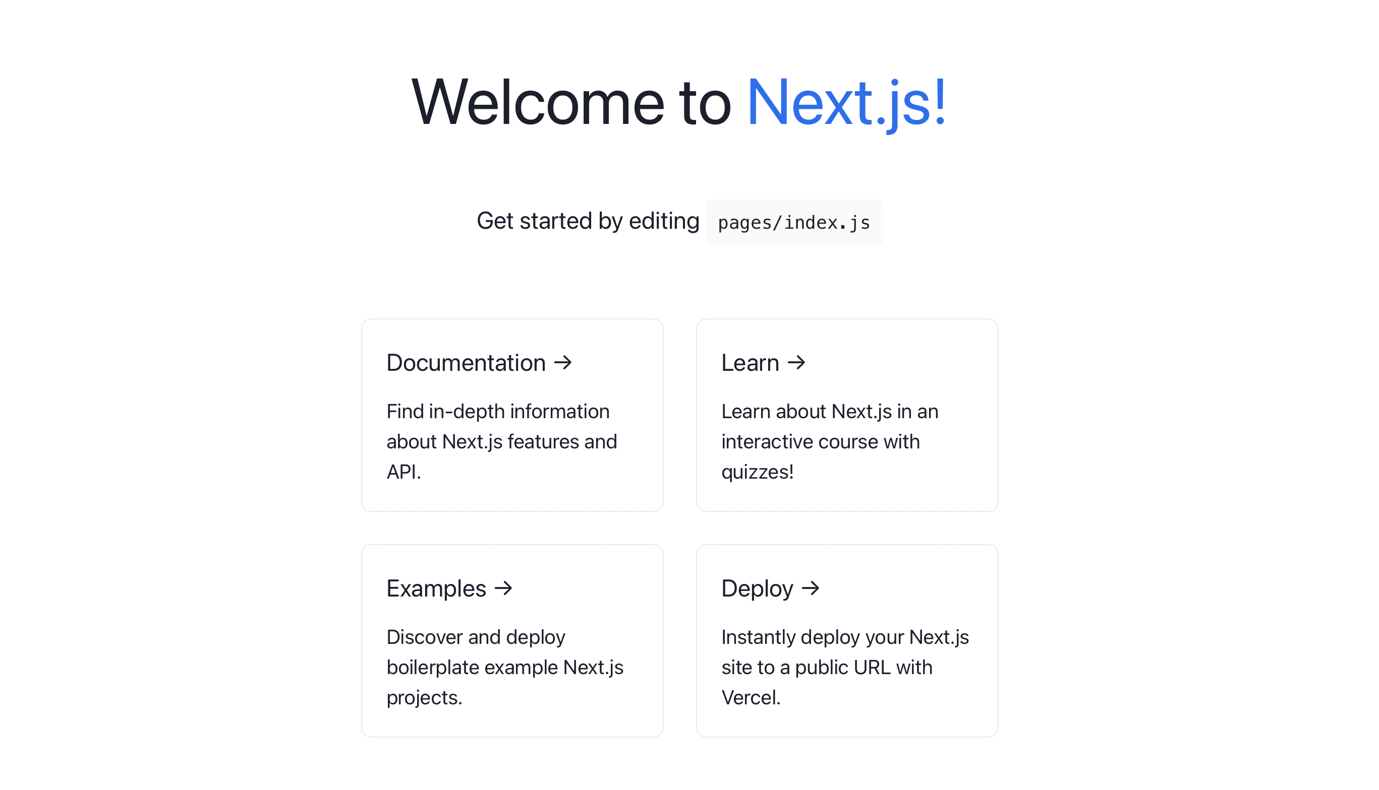
You'll notice that the default Next.js application styles have changed. Mainly the typography on the page, but some of the spacing was also impacted by this change -- this tells us that Chakra-UI has been implemented and is working as expected.
Now that we have the application working and the ChakraProvider is correctly configured, let's take a look at how we can implement the base styles using Chakra.
We'll start by creating a new directory to keep all of our Chakra-UI-related files together.
mkdir chakra && cd chakra && touch index.js
// /chakra/index.js

import { extendTheme } from "@chakra-ui/react"

export const theme = extendTheme({
  colors: {
    brand: {
      50: "#eaeaea",
      100: "#fafafa",
      200: "#0070f3",
      900: "#1a202c",
    },
  },
});
Here we've extended the default Chakra-UI theme with our custom brand colors. We can overwrite any of Chakra's defaults allowing us to fully define a custom theme. The method
extendThemehelps us update the default theme safely.☝️ NOTE:
The theme file is the only file you'll need to configure any of the
Chakra-UIpresets, but in this project we'll be breaking things out into their own files simply for better readability.
Now, we can simply pass our custom theme into the ChakraProvider which will then make it available to our entire application.
// /pages/_app.js

import { ChakraProvider } from "@chakra-ui/react"
import { theme } from "../chakra"

console.log({ theme });

function MyApp({ Component, pageProps }) {
  return (
    <ChakraProvider theme={theme}>
      <Component {...pageProps} />
    </ChakraProvider>
  )
}

export default MyApp
There won't be any noticeable changes to the application this time around, but with the above file in place, we've got everything set up as we'll need for our application.
💡 NOTE:
If you copied the code above, you should see the current theme object logged to the console -- it's a good idea to go through it from time to time. You can also refer to Chakra-UI's default theme reference page.
Also it might be a good time to take a look at some of the utlities that you get out of the box with Chakra-UI.
☝️ NOTE: Chakra provides a CSS reset automatically, but you can always opt-out of it if you want:
<ChakraProvider theme={theme} resetCSS={false}>
    <Component {...pageProps} />
</ChakraProvider>
Let's start by copying the global styles from the default app, to our Chakra-UI configuration. The default Chakra theme object has a style property on it that helps us manage the base styles of our application. We'll create a separate file called global.js where we'll define all of our base styles. We can then simply import this file into our theme configuration once we're ready.
touch chakra/global.js
// chakra/global.js

export const styles = {
  global: (props) => ({
    'html, body': {
      padding: 0,
        margin: 0,
            fontFamily: `-apple-system, BlinkMacSystemFont, Segoe UI, Roboto, Oxygen,
    Ubuntu, Cantarell, Fira Sans, Droid Sans, Helvetica Neue, sans-serif`
    },
    a: {
      color: 'inherit',
      textDecoration: 'none'
    },
    '*': {
      boxSizing: 'border-box'
    }
  })
}
Now we simply need to add these styles to our custom theme object:
// chakra/index.js

import { extendTheme } from "@chakra-ui/react"
import { styles } from "./global"

export const theme = extendTheme({
  styles,
  colors: {
    brand: {
      50: "#eaeaea",
      100: "#fafafa",
      200: "#0070f3",
      900: "#1a202c",
    },
  },
});
Now we can copy some of the base styles from Home.module.css, as you'll see we've initially focused on the base elements that we can target directly via their element selectors.
// chakra/global.js

export const styles = {
  global: (props) => ({
    /* ... */
    main: {
      minHeight: '100vh',
      padding: '4rem 0',
      flex: 1,
      display: 'flex',
      flexDirection: 'column',
      justifyContent: 'center',
      alignItems: 'center'
    },
    footer: {
      display: 'flex',
      flex: 1,
      padding: '2rem 0',
      borderTop: '1px solid #eaeaea',
      justifyContent: 'center',
      alignItems: 'center',
      a: {
        display: 'flex',
        justifyContent: 'center',
        alignItems: 'center',
        flexGrow: 1,
      }
    },
    code: {
      background: '#fafafa',
      borderRadius: '5px',
      padding: '0.75rem',
      fontSize: '1.1rem',
      fontFamily: `Menlo, Monaco, Lucida Console, Liberation Mono, DejaVu Sans Mono,
    Bitstream Vera Sans Mono, Courier New, monospace`
    }
  });
}
Next up we'll create some textStyles for each of the typography-related classes.
textStylesare a Chakra-UI convention that provides a clean API to manage font styles specifically and can be reused to style the typography components.
We'll define the next textStyles that we'd like to re-use for both the .title and description classes from the default stylesheet.
touch chakra/text-styles.js
// chakra/text-styles.js

export const textStyles = {
  title: {
    margin: 0,
    lineHeight: 1.15,
    fontSize: '4rem',
    textAlign: 'center'
  },
  description: {
    margin: '4rem 0',
    lineHeight: 1.5,
    fontSize: '1.5rem',
    textAlign: 'center'
  }
}
And then we can make sure we update our custom theme object with the new textStyles.
// chakra/index.js

import { textStyles } from './text-styles';

export const theme = extendTheme({
  textStyles,
  /* ... */
});
Next, we can focus our attention on the markup and use some of Chakra-UI's modular components to rebuild the current UI.
// pages/index.js
import { Box, Code, Container, Flex, Grid, Heading, Link, Text } from "@chakra-ui/react"

export default function Home() {
  return (
    <Container px={0} py={10}>
      <Head>
        <title>Create Next App</title>
        <meta name="description" content="Generated by create next app" />
        <link rel="icon" href="/favicon.ico" />
      </Head>

      <main>
        <Heading as="h1" textStyle="title">
          Welcome to <Link color="brand.200" href="https://nextjs.org" isExternal>Next.js!</Link>
        </Heading>

        <Text textStyle="description">
          Get started by editing{' '}
          <Code>pages/index.js</Code>
        </Text>

            {/* ... */}

    </Container>
  )
}
So far we've added the
Containercomponent around the entire page. We didn't need to make any changes to theHeadsection, but we've removed the styles from themainelement because its syles come directly from our base styles defined inchakra/global.js.You'll notice that both the
HeadingandTextcomponents are using the customtextStyleswe defined for both thetitleand thedescription.And we're able to access the blue color we defined in our custom theme via the
brand.200selector for the anchor tag.
Let's actually take a closer look at the Link Component that renders the anchor tag and the Code component:
<Heading as="h1" textStyle="title">
    Welcome to <Link color="brand.200" href="https://nextjs.org" isExternal>Next.js!</Link>
</Heading>

<Text textStyle="description">
  Get started by editing{' '}
  <Code>pages/index.js</Code>
</Text>
☝️NOTE:
The
Linkcomponent being used here is imported from Chakra-UI (not to be confused with the Next.js Link component which is used for "internal" links and routing which we won't be using it in this application).The Chakra-UI Link component takes an
isExternalboolean prop that adds the conventional best practice attributes to the markup for external links - take a look at the markup that actually gets sent to the browser:<a target="_blank" rel="noopener noreferrer" class="chakra-link css-f4h6uy" href="https://nextjs.org">Next.js!</a>Just like the
mainelement, we've already defined theCodecomponent's styles in thechakra/global.jsfile, so we simply use the component as is and the styles are simply inherited.
Next, we'll tackle the card grid, this is where the bulk of our markup gets applied, and we'll take a rather unconventional approach to get it done, so stick with me.
First, we'll create a style object with the styles we'll need for the entire card grid:
// pages/index.js

const cardStyles = {
  margin: 4, // spacing preset for '1rem'
  padding: 6, // spacing preset for '1.5rem'
  textAlign: 'left',
  color: 'inherit',
  textDecoration: 'none',
  border: '1px solid',
  borderColor: 'brand.50',
  borderRadius: '10px',
  transition: 'color 0.15s ease, border-color 0.15s ease',
  maxWidth: '300px',
  '_hover': {
    color: 'brand.200',
    borderColor: 'brand.200'
  },
  '_focus': {
    color: 'brand.200',
    borderColor: 'brand.200'
  },
  '_active': {
    color: 'brand.200',
    borderColor: 'brand.200'
  },
  h2: {
    marginBottom: 4, // spacing preset for '1rem'
    fontSize: '2xl' // typography preset for '1.5rem'
  },
  p: {
    m: 0,
    fontSize: 'xl', // typography preset for '1.25rem'
    lineHeight: 'base', // typography preset for 1.5
  }
}
⚠️ NOTE:
As I mentioned above this is a bit of an unconventional approach -- but I find it to be the easier way to approach the problem. Chakra-UI does provide a decent API to define what they refer to as Layer Styles. In concept, they're very similar to the
textStyleswe defined earlier. Although, I find this particular API to be a bit limiting, and so I usually opt for the approach we're taking here.Another thing to note in the styles defined above is that we're easily defining the
hover,focus, andactivestate styles as well.
Now we can simply spread out the style object we just defined and use it to apply our styles to the elements we want to style.
<Flex w="full" flexDir={['column', 'row']} align="center" justifyContent="center" wrap="wrap">
<Link href="https://nextjs.org/docs" isExternal {...cardStyles}>
<Heading as="h2" {...cardStyles.h2}>Documentation →</Heading>
<Text {...cardStyles.p}>Find in-depth information about Next.js features and API.</Text>
</Link>
<Link href="https://nextjs.org/learn" isExternal {...cardStyles}>
<Heading as="h2" {...cardStyles.h2}>Learn →</Heading>
<Text {...cardStyles.p}>Learn about Next.js in an interactive course with quizzes!</Text>
</Link>
<Link
href="https://github.com/vercel/next.js/tree/master/examples"
isExternal
{...cardStyles}
>
<Heading as="h2" {...cardStyles.h2}>Examples →</Heading>
<Text {...cardStyles.p}>Discover and deploy boilerplate example Next.js projects.</Text>
</Link>
<Link
href="https://vercel.com/new?utm_source=create-next-app&utm_medium=default-template&utm_campaign=create-next-app"
{...cardStyles}
>
<Heading as="h2" {...cardStyles.h2}>Deploy →</Heading>
<Text {...cardStyles.p}>
Instantly deploy your Next.js site to a public URL with Vercel.
</Text>
</Link>
</Flex>
It may seem like there's a lot going on here, but in fact, it's quite simple.
We start with the
Flexcomponent to help us create the card grid layout. You'll notice we're using a lot of intuitive utilities likewfor 'width' andmaxWfor 'max-width', etc... Chakra-UI provides several of these utilities called "style props" that map to different css properties. What's more is that there's an entire design system already available under the hood, that you can utilize presets from for each of these attributes.So here,
w="full"compiles to css as:width: 100%;You may also notice that we're providing an array of arguments for the
flexDirattribute which is a shorthand for 'flex-direction'. Each index of this array represents a breakpoint:[sm, md, lg, xl]so each value is mapped to the according to each breakpoint. There's also an alternative object syntax:{md: '2', lg: '1'}. This concept can be applied to any Chakra-UI attribute allowing for granular breakpoint control throughout the application,You can take a look at more info on responsive styling with Chakra-UI.
And lastly, the only thing left for us to do is style the footer with Chakra-UI:
<footer>
  <Flex
    as={Link}
    href="https://vercel.com?utm_source=create-next-app&utm_medium=default-template&utm_campaign=create-next-app"
    isExternal
    justify="center"
    align="center"
    flex="1"
    >
    Powered by{' '}
    <Box as="span" h='1em' ml={2}>
      <Image src="/vercel.svg" alt="Vercel Logo" width={72} height={16} />
    </Box>
  </Flex>
</footer>
The footer element is once again being styled from the global styles we defined initially, so we can simply just implement it as is.
We're doing something interesting with the
Linkcomponent this time, we're utilizing the very powerfulasprop - similar to styled-components - it allows us to inherit the characteristics of one component, but render an entirely different component -- in our case theFlexcomponent is rendered as aLinkcomponent.And lastly, we style the logo span and use that to render the logo svg.
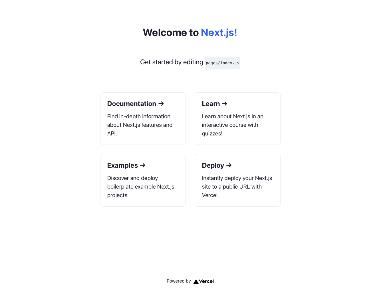
And that's it, we've essentially re-worked the Next.js default splash page using Chakra-UI. I hope that this helps demonstrate just how simple developing with Chakra-UI can be. And just to be clear we've only scratched the surface of what both Next.js and Chakra-UI are capable of.
In the next installment of this series, we'll cover how to implement themed layouts and color modes with our custom theme. Until then feel free to reach out with questions or issues and happy coding!


